Thorp and Sailor's Grave Board

UPDATED Photoshop artwork - check it out!

XHonusWagnerX - 5-14-2008 at 10:19 PM

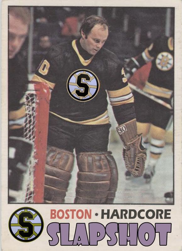
I figured maybe it can be the laminate for the tour....

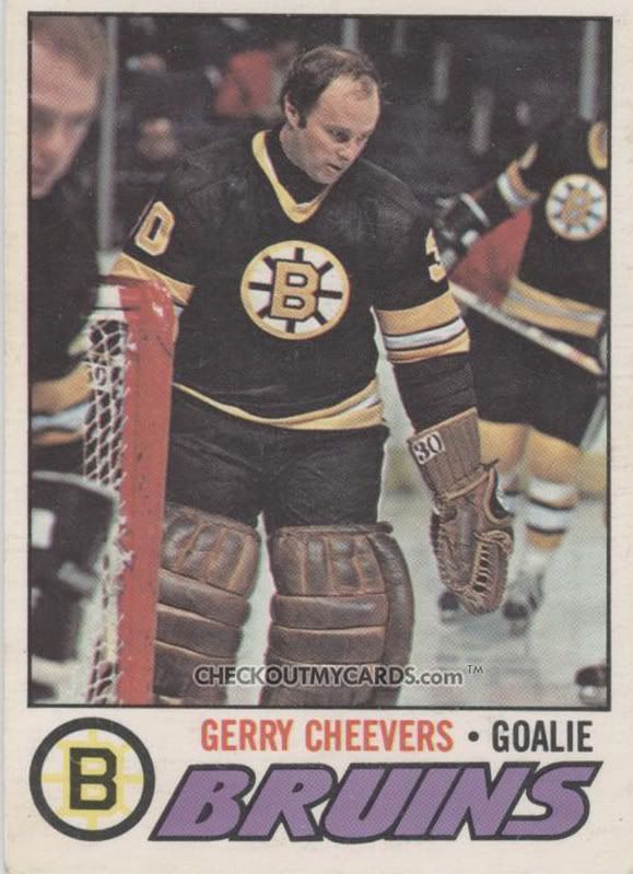
I STARTED WITH THIS....


AND TURNED IT INTO THIS....

clevohardcore - 5-14-2008 at 11:45 PM

IF you could distress that logo that would be easy to mistake it.

Dave - 5-15-2008 at 06:13 AM

if you just adjust the contrast on the logo, it would probably blend in really nice.


good job tho, looks good


and do the same thing to the guy in the background too! be sweet

XHonusWagnerX - 5-15-2008 at 06:32 AM

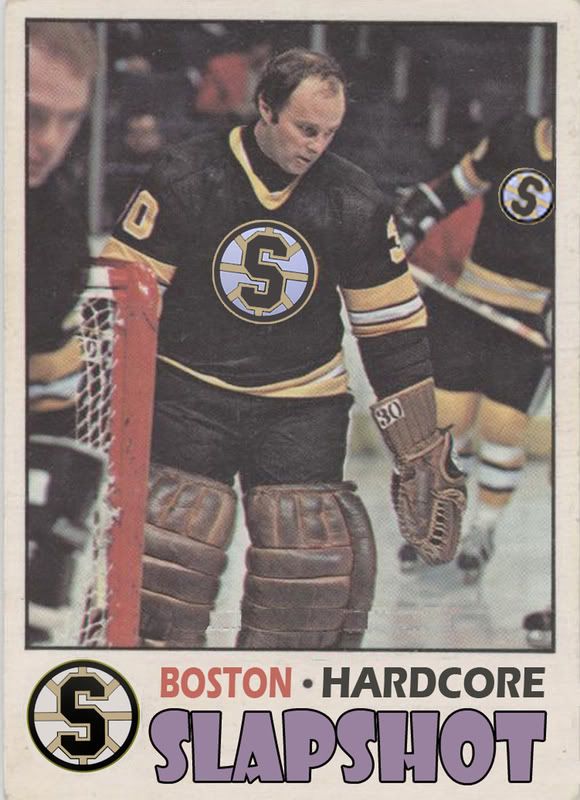
I did actually distress the logo on the jersey right after I posted that picture and it looks much better. I just wish it was a picture of cheevers with his mask on.

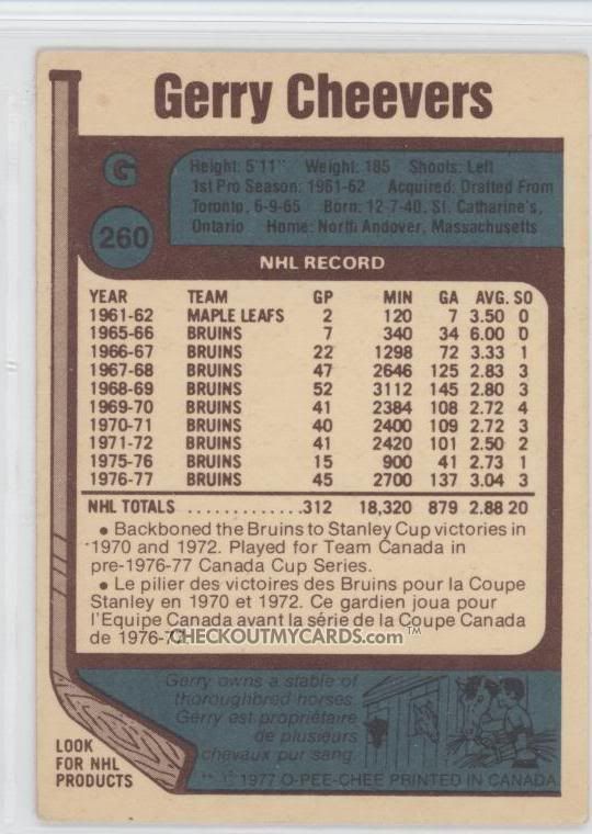
I want to make the back look like the back of the card too.

Choke.....................Center
Ed..........................Right Wing
Chris.......................Left Wing
Mark.......................Defense

And then put all the tour dates.

panzerkreuzer - 5-15-2008 at 08:12 AM

no tourdates please. i donīt like tour shirts.

XHonusWagnerX - 5-15-2008 at 08:49 AM

Quote:
Originally posted by panzerkreuzer
no tourdates please. i donīt like tour shirts.


Its not for a shirt, its for the laminate/tour pass.

panzerkreuzer - 5-15-2008 at 08:58 AM

then is fine. sorry.

XHonusWagnerX - 5-15-2008 at 11:31 AM

depending on how it comes out I might do 1 shirt of it on CafePress.... I dont know though.

XHonusWagnerX - 5-15-2008 at 09:52 PM


DeathByForce - 5-15-2008 at 09:57 PM

hahaha that looks really cool!

Murk - 5-15-2008 at 10:01 PM

cool. :yes:

tireironsaint - 5-15-2008 at 10:06 PM

Great job, Honus. I would love to get ahold of one of those.

XHonusWagnerX - 5-15-2008 at 10:15 PM

Quote:
Originally posted by tireironsaint
Great job, Honus. I would love to get ahold of one of those.


Thanks guys!!!! I really put alot of work into it and even figured out some stuff I had never done before. I'm actually proud of myself. :-)

I will probably print and laminate extras, so dont worry!

Siczine.com - 5-16-2008 at 01:17 AM

That is definitely some top notch work there.

Dave - 5-16-2008 at 06:19 AM

one more thing you can do that is easy, sample the white from the original logo(with the eye dropper tool), cos it's alittle cream colour really, then put it into yours, then it would look mint!


other wise it turned out cool

JawnDiablo - 5-16-2008 at 06:41 AM

pretty damn cool Honus

XHonusWagnerX - 5-16-2008 at 07:31 AM

Quote:
Originally posted by Dave
one more thing you can do that is easy, sample the white from the original logo(with the eye dropper tool), cos it's alittle cream colour really, then put it into yours, then it would look mint!


other wise it turned out cool


You mean the logo on Cheevers jersey?

One think I want to try and do is make the logo on the other guys jersey a little more blury like in the original. Anyone know how I can do that?

CR83 - 5-16-2008 at 10:47 AM

Honus, fantastic job dude!

Dave - 5-16-2008 at 05:33 PM

yeah the logo on his chest, if you sample the white from the original then use it to replace the white you have it would look mint.

use the blur tool for the background guy to blend his in logo

.