Originally posted by XHonusWagnerX
| Quote: | Originally posted by Lucabrasi
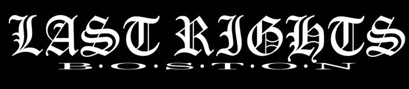
I'm gonna say without the dots. The dots make it look like an acronym and its not supposed to be (is it?) |
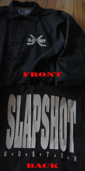
No... I got the idea from the back of a Slapshot windbreaker that I have because I thought it looked cool.
 |