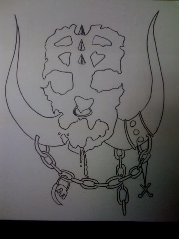
Originally posted by XHonusWagnerX
| Quote: | Originally posted by Boycott Christian HC
Awesome! I was just reading the thread again, and I was about to say:
"Honus, I'd like to see you draw one shirt by hand",
and then I scroll down and see this haha. Go for this one! |
I would like to go with it, but I'm not sure what else to do to it. It needs 'more something' but I'm not sure. |