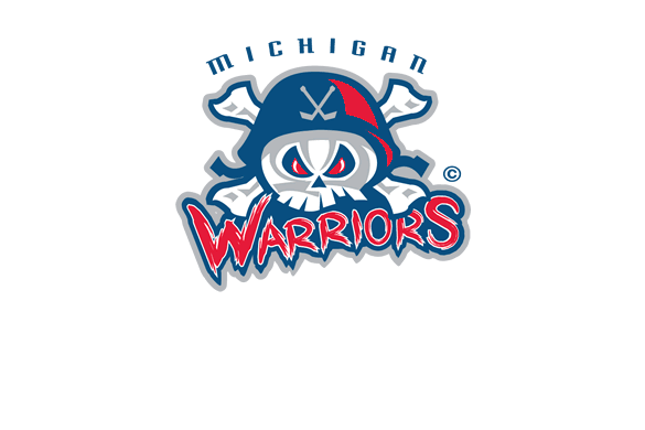
Just get rid of the hockey sticks and add THORP to the top.ShawnRefuse - 2-12-2013 at 04:12 PM
Keep the hockey sticks and change the text to be thorp instead of Michigan. And make it black and gold for colors. Maybe.... sentrand - 2-12-2013 at 05:37 PM
Keep the hockey sticks and change the text to be thorp instead of Michigan. And make it black and gold for colors. Maybe....
BDx13 - 2-13-2013 at 10:03 PM
is that a nhl team? Six66Mike - 2-14-2013 at 08:02 AM
psssht get rid of the hockey sticks... that's the best part lol
BD it's the NAHL, never heard of it til now but apparently it's older than I am. I was gonna say it sounds like OHL/WHL/QMJHL grade CHL hockey but
looking at the wiki page it's Tier 2 juniors, I'd say up to 18-19 year olds playing.XnMeX - 2-14-2013 at 09:52 AM
I was looking for a sports logo for a flyer I was working on and came across this in a google search. I was thinking no hockey sticks as it doesn't
really have to do with Thorp... Maybe an anchor instead? BDx13 - 2-15-2013 at 12:48 AM
hook it up, monty!sentrand - 2-15-2013 at 12:51 AM
The anchor would fit well on it. Discipline - 2-15-2013 at 03:18 PM
Not sold on the THORP text...sentrand - 2-15-2013 at 05:56 PM
YES YES YES!!!!!!MattyA - 2-15-2013 at 10:19 PM
Thorp does look weird, maybe make the way warriors is written?Dennis Mc - 2-16-2013 at 12:41 AM
Fucking great!!!DaveMoral - 2-16-2013 at 03:15 AM
Nice!BDx13 - 2-16-2013 at 09:38 PM
nice one, monty! anchor looks good, but you're right, the font's not right. not sure what the right one is but give it another shot! the arch on
the original is nice, too.panzerkreuzer - 2-17-2013 at 07:16 AM
short question aside, wouldn´t there any copyright problems?DaveMoral - 2-17-2013 at 08:27 AM
Shouldn't be if it's significantly changed enough.XnMeX - 2-17-2013 at 12:26 PM
it's possible, panzer, depending on how much we change it. but it's not worth anyone's trouble to come after some punks selling a couple dozen
tshirts.lifeisabitch - 2-18-2013 at 12:24 PM
since the shirts are never sold and given as gifts and I doubt anyone from said team will ever see the shirt... yeah we good
but damn it now everyone has seen this one so it wont be a surpriseSS76 - 2-21-2013 at 12:51 PM
Not feeling that logo at all. Looks like something for a kids little league team. Just my opinion.BDx13 - 2-22-2013 at 01:02 AM