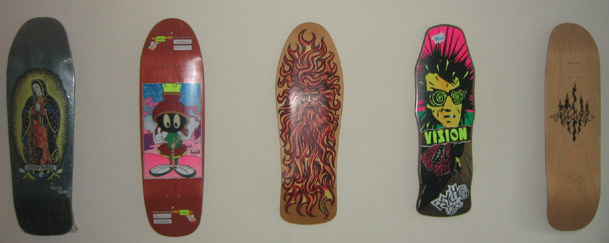
Thorp and Sailor's Grave Board

okay need some help

defstarsteve - 8-25-2005 at 12:49 AM

my boy did the first graphics for def-star skates
but
I need some opinions/help
I dig this version


but this version is so much meaner


but I can't fit def-star in anywhere

any suggestions

maximum print size is 5" or 6" by 14" I can't do full board prints yet...
help me figure this out and it'll mean more free stuff for you

GOLD GRILL - 8-25-2005 at 12:51 AM

dude, the top one is hard as fuck.

hollymaconmovies - 8-25-2005 at 01:00 AM

First one is awesome. If you wanted to use the second one, which is also really good, the only thing I could see is splitting def & star: one on each cheek, eye brow or in his eyes (around the corneas). But that's all I've got and it ain't much.

GabeTexasGAMC - 8-25-2005 at 02:32 AM

second one looks hard as fuck.
Im not too into the font.

Discipline - 8-25-2005 at 03:08 AM

Quote:
Originally posted by GabeTexasGAMC
second one looks hard as fuck.
Im not too into the font.

John Bulldog - 8-25-2005 at 05:57 AM

second one

XHonusWagnerX - 8-25-2005 at 07:00 AM

Quote:
Originally posted by John Bulldog
second one


I like the second one better too. I bet that XnMeX can find a way to work DEFSTAR into it. Hes done tons of graphics for me in the past.

BDx13 - 8-25-2005 at 07:18 AM

if you go with option one, i'd suggest not centering the skull - "star" looks cramped. aslo, i am not really a fan of the type treatment.

i greatly prefer option two, and would suggest leaving it as is, but... are ya ready? ...do a "def star" print on the nose or the tail.

or do like the old jason jessee sun god board, and work the name into the design:


RomanticViolence - 8-25-2005 at 07:33 AM

Quote:
Originally posted by BIG DUANE
if you go with option one, i'd suggest not centering the skull - "star" looks cramped. aslo, i am not really a fan of the type treatment.

i greatly prefer option two, and would suggest leaving it as is, but... are ya ready? ...do a "def star" print on the nose or the tail.

or do like the old jason jessee sun god board, and work the name into the design:


Good idea duane!

DAK - 8-25-2005 at 09:09 AM

I like both.

Voodoobillyman - 8-25-2005 at 11:59 AM

I like the idea of using two and trying to put the company name in the eyeballs somehow.

defstarsteve - 8-25-2005 at 01:43 PM


this might be it
simple yes but it works

clevohardcore - 8-25-2005 at 01:51 PM

dude I really like the EYES one alot. What if you make DEF STAR like a faded writing across the the head in a background or something. I like the eyes one close up the best

defstarsteve - 8-25-2005 at 02:15 PM

if I was having them printed by one of my big suppliers, I would do some sick ass lettering
but I am printing these here, and this will be my first multi color print so I goota take it easy on the special effects
but we just keep trying to get better all the time

we rule shirts stickers and poster...now its gonna be boards

defstarsteve - 8-25-2005 at 02:24 PM


this is the next one we are working on
the pool coping will be teeth from skulls all lined up

XHonusWagnerX - 8-25-2005 at 03:33 PM

Quote:
Originally posted by defstarsteve


this might be it
simple yes but it works


Thats cool, but what if the face continued down on each side of the Def-Star logo? That way it wouldnt look like a full strip of blank space. Or you could make Teeth on the face and put DEFSTAR on the teeth or even make teeth the shape of the letterse!

thedog - 8-25-2005 at 05:30 PM

first of all the skull is sick, nice work on that.
what about if you just made the face a little narrower.... then have "def" on the left of it and "star" to the right of it.
with def-star at the bottom there is to much white spce on the sides of it.
if you do leave it at the bottom, what about stretching the font out more so there is less white space.

Voodoobillyman - 8-25-2005 at 07:31 PM

I love the hockey mask ( jason ) concept, man you guys are good, how would I get ahold of you to submit some artwork and possibly hire you to do a print or two for me Def Star??? Let me know seriously, I am very interested. I have been tattooing for 12 years now and I think I have the skills to pay the bills when it comes to certain styles;)

tireironsaint - 8-25-2005 at 08:51 PM

Quote:
Originally posted by defstarsteve


this might be it
simple yes but it works
By far the best one, maybe just spread or stretch the lettering a bit wider. The only other thing I think you might try is to turn it the other way and put DEF above the skull and STAR below it. Either like.................
DEF
skull
STAR
or
D
E
F
skull
S
T
A
R

Somethin' like that. Sorry, I don't have photoshop or none o' that fancy shit, but I think you get the idea. Oh, the hockey mask skater is fuckin' beautiful, I wanna see that shit finished.

KyleOz - 8-25-2005 at 09:05 PM

I can't choose, I like both. I like the detail of the skull in the first one especially though.

defstarsteve - 8-26-2005 at 12:24 AM

Quote:
Originally posted by Voodoobillyman
I love the hockey mask ( jason ) concept, man you guys are good, how would I get ahold of you to submit some artwork and possibly hire you to do a print or two for me Def Star??? Let me know seriously, I am very interested. I have been tattooing for 12 years now and I think I have the skills to pay the bills when it comes to certain styles;)


email me
we want to make def-star not just a printing company but bring out cool shit for kids to skate on and wear
I am always looking for new art so send it bro

and thanks for all the support
we are working on even more lettering to try to make this perfect
we can take our time and make it right
the glory of doing things for love not for profit

clevohardcore - 8-26-2005 at 11:36 AM

WHAT IF DEF - STAR was at the tail or head of the board?

Like a solid white background about 2 or 3 inches thick and def-star at the top and the same for the bottom. This will still give you a huge closeup of the rad-ass eyes and also be able to use the name not once but twice. Dude go witht he closeup though. that looks really fucking sweet.

clevohardcore - 8-26-2005 at 11:37 AM

at the HEAD and TAIL of the board I ment.

RomanticViolence - 8-26-2005 at 11:48 AM

Quote:
Originally posted by tireironsaint
Oh, the hockey mask skater is fuckin' beautiful, I wanna see that shit finished.


Indeed!

clevohardcore - 8-26-2005 at 11:53 AM

ALso that Jason Jesse board was santa cruz right?? I had a frined who road that back in the day. That board was a fucking tank. It was wider that the laength of someones foot.

BDx13 - 8-26-2005 at 01:02 PM

i'm looking at the jason jessee as i write this. technically, its a mini.


defstarsteve - 8-26-2005 at 01:24 PM

uh oh
big d is collector
do you go to the skull and bones web site
there are so many nice boards over there...

as for nose and tail
i can't do them
only center of the board prints for now....
damn my lacking in the big monster screens to do them


clevohardcore - 8-26-2005 at 01:31 PM

Did this board come in 2 sizes? I swear it was huge. Like the Mark Gator faces deck vs the face one before that. Or like the Natas Kopas deck with choice of big vert or small street deck.

clevohardcore - 8-26-2005 at 01:55 PM

Hey Steve. I met that SKULL AND BONES dude before at a show. Nice guy. That site is really sweet looking too. I cna't get over the deck collections some of those dudes have.

BDx13 - 8-26-2005 at 01:58 PM

actually, the one i have is a different shape and little bit bigger than the one i posted on the previous page. that one is the "pro-series 88", which i believe was the first version. i think mine came out a little later. anyway, they are both minis. i believe the Neptune board was the full size at that time. i think these were both reissued, but i've never seen them. actually, the psycho stick was as well. i just hope they did different print graphics or board collors or something... i gotta be able to prove mine are OG to bring in the $$!


clevohardcore - 8-26-2005 at 02:02 PM

Ya those graffixs are the diference of mini and regular from what I remember. Damn this shit is really sweet. I never thought of collecting decks before. Makes me wish I didn't destroy my old decks skating them.

clevohardcore - 8-26-2005 at 02:07 PM

I never skated Santa Cruz. I did use the SLIMEBALLS wheels though. I had some friends that road them but for some reason I never really like the deck feel for whatever reason. I loved the graffixs though. I mostly skated VISION POWELL and my fav ALVA. I also had a thing for H STREET just befroe I quit skating. I bought 4 of their decks twards the end.

defstarsteve - 8-26-2005 at 02:10 PM

well good news for you there mr clevo
h-street is coming back
they are the compnay that is supplying us with decks atthe moment
i wish I could collect, but right now I collect paychecks

BDx13 - 8-26-2005 at 02:27 PM

steve, did i tell you i used to work at capital skateboards (which was also intensity skates, nicotine wheel company, big east wheels, silverstar and a few other companies) back in the mid-90s doing design work? good times.

defstarsteve - 8-26-2005 at 02:32 PM

no i didn't know that
it's good work if you can find it...

defstarsteve - 8-28-2005 at 09:24 PM

okay one again back is the incredible